
The Five Core Principles of Good Interface Design
Discover the foundational concepts that separate excellent interfaces from confusing ones. Learn clarity, consistency, feedback, and more.
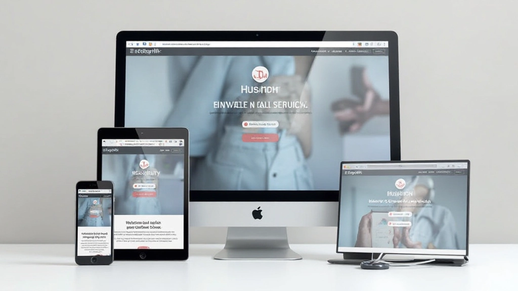
Read ArticleLearn how to design responsively from the ground up. We’ll explore flexible layouts, breakpoints, and testing strategies that ensure your designs work beautifully on every device — from tiny phones to large desktops.
Over 60% of web traffic now comes from mobile devices. That’s not a trend — it’s reality. But here’s the thing: many designers still build for desktop first, then squeeze their layouts onto phones. That’s backwards.
Mobile-first design starts with the smallest screen and builds up from there. It forces you to prioritize content, simplify navigation, and think about what actually matters. When you get it right on mobile, the desktop version practically designs itself.
We’re going to walk through the practical approach. You’ll learn how to structure your CSS, set up breakpoints, and test across real devices. It’s not complicated — it just requires thinking differently about how you approach a project.

Mobile-first CSS is straightforward. You write styles for the smallest viewport first — typically 320px to 480px. Then you use media queries to add complexity as screen space increases.
This means your base CSS is lean and focused. No unnecessary columns, no complex grids, no fancy positioning. Just clean, semantic HTML with minimal styling. When you’re designing for a 375px screen, you can’t afford clutter.
The three breakpoints we recommend: 640px for tablets, 1024px for laptops, and 1440px for large desktops. These align with how people actually use devices. Don’t obsess over hitting every possible screen size — these three breakpoints cover 95% of real usage.


Flexbox and CSS Grid are your tools here. On mobile, everything stacks vertically using flex-direction: column. When you hit 640px, you might introduce a two-column layout with flex-direction: row and flex-wrap: wrap.
Use max-width to prevent content from getting too wide on large screens. A max-width of 1200px to 1400px feels right for most applications. Anything wider and reading becomes uncomfortable — your eye has to travel too far horizontally.
Padding and margin scale differently too. Use viewport-relative units like vw for spacing, or better yet, use CSS clamp() to create fluid sizing. For example: padding: clamp(1rem, 3vw, 2rem) gives you responsive padding that adjusts between screens automatically.
Browser DevTools are great for quick checks, but they’re not a substitute for real device testing. Your laptop’s viewport emulation doesn’t account for actual touch behavior, network speeds, or how your design looks in sunlight.
Test on at least 3-4 actual devices. Include an older iPhone, a modern Android phone, a tablet, and a desktop. You’ll catch issues that never show up in emulation — slow rendering, touch zones that are too small, images that don’t scale properly.
Pro tip: Use Chrome’s remote debugging to test on physical Android devices. It’s free and shows you exactly how your site performs on real hardware with real network conditions.
Pay attention to orientation changes. Rotate your phone and watch what happens. Does the layout reflow correctly? Do images resize? Does text remain readable? These transitions reveal layout problems quickly.

Here’s what you’ll do on your next project:
Sketch and design for 375px width. This is your starting point. Force yourself to simplify. What content is absolutely necessary? What can wait?
Code your mobile styles without any media queries. Use semantic HTML and clean class names. This becomes your foundation.
At 640px, introduce a media query. Maybe you go two-column here. Add spacing and refine typography. Test on actual tablets.
At 1024px and beyond, you can add more complex layouts. But don’t overdo it. Restraint looks better than maximizing every pixel.

Mobile-first design isn’t just about making things work on phones. It’s about making better design decisions overall. When you start with constraints, you think more carefully. You prioritize ruthlessly. You remove unnecessary elements.
The result? Cleaner layouts. Faster websites. Better user experiences across all devices. Your desktop users benefit from the clarity you brought to mobile design. Your tablet users get a thoughtful in-between experience.
Start your next project with mobile. Sketch small. Code lean. Test real. You’ll be surprised how much better your designs become when you work within constraints instead of against them.
Take these principles to your next project. Start mobile, test on real devices, and iterate based on what you learn. Your users will notice the difference.
Explore More Design PrinciplesThis article provides educational information about mobile-first design principles and responsive web design techniques. While the approaches discussed here represent industry best practices, specific implementation details may vary depending on your project requirements, target audience, and technical constraints. Always test your designs across actual devices and gather feedback from real users. Design decisions should be informed by user research and analytics specific to your context.