
The Five Core Principles of Good Interface Design
Discover the foundational concepts that separate excellent interfaces from confusing ones. Learn simplicity, feedback, consistency, affordance, and constraint.
Read ArticleAccessibility isn’t optional. Learn how to design interfaces that work for everyone, including users with disabilities. Master WCAG standards, contrast ratios, and readable typography.

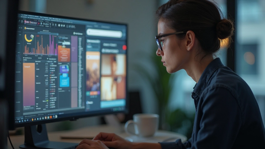
About 1 in 4 adults in the US live with some type of disability. That’s not a small number. When you’re designing interfaces, you’re making decisions that directly impact whether someone can use your product or not. It’s that simple.
Good accessibility isn’t about compliance or checking boxes. It’s about building experiences that work for real people with real needs. Color blindness, low vision, dyslexia, motor difficulties — these aren’t edge cases. They’re common conditions that affect how millions of people interact with screens every day.
The best part? When you design accessibly, everyone benefits. Better contrast helps people on bright screens. Larger type is easier to read. Clear navigation helps people in a hurry. You’re not adding features for a small group — you’re improving the foundation for everyone.

Contrast ratio is the measurable difference between text color and background color. It’s not subjective. The WCAG (Web Content Accessibility Guidelines) gives you exact numbers: you need at least 4.5:1 for normal text and 3:1 for large text to meet AA standards.
People with low vision, color blindness, and even people viewing screens in bright sunlight all benefit from strong contrast. It’s not just about passing a checklist — it’s about readability. Dark text on light backgrounds works best. If you’re using colored text, make sure it has enough contrast against its background.
Font choice and sizing matter more than most designers realize. You’re not just picking something that looks nice — you’re choosing something people can actually read. Sans-serif fonts like Arial, Helvetica, and Verdana are easier to read on screens than serif fonts. That’s not a preference, that’s neuroscience.
These aren’t suggestions. They’re based on accessibility research:
Body text should be at least 16px. Smaller than that and people start squinting. Headings should be proportionally larger — usually 24px or more depending on hierarchy.
Line spacing (line-height in CSS) should be at least 1.5 for body text. More space between lines makes reading easier, especially for people with dyslexia or low vision. Don’t make text feel cramped.
Tight kerning looks polished but can hurt readability. Give letters some breathing room. A small increase in letter-spacing makes text noticeably easier to scan.
Avoid ultra-thin fonts (weight 300 or less) for body text. They’re hard to read, especially at smaller sizes. Regular (400) or semi-bold (600) work best for content people actually need to read.


Here’s something many designers get wrong: never rely on color alone to convey information. About 8% of men and 0.5% of women have some form of color blindness. If your interface only uses red and green to show status, you’re losing them immediately.
This doesn’t mean you can’t use color. It means you need to combine it with something else — icons, patterns, text labels, or positioning. Red and green together? Add an icon. A colored line to show status? Add a checkmark or X symbol too. Colored background for a warning? Include the word “Warning” as well.
Use sufficient contrast between foreground and background colors. Test your palette with color blindness simulation tools. Many online tools let you see how your design looks to someone with protanopia, deuteranopia, or tritanopia. It takes 2 minutes and could catch a major accessibility issue.
Choose color palettes that work across different viewing conditions. What looks good on your monitor might be unreadable on someone’s phone in bright sunlight. Test in different environments and lighting.
Use WebAIM’s contrast checker or other tools to verify your color combinations meet WCAG standards. Test on actual devices. Don’t rely on your monitor alone.
Think about someone with low vision trying to use your interface. Would they be able to read the text? Would they understand what’s happening without relying on color?
Screen readers, zoom features, and color blindness simulators aren’t just for testing. Use them while designing. Understanding how people actually use your interface changes everything.
Create design system documentation that includes accessibility requirements. Specify minimum font sizes, contrast ratios, and color usage rules. Make it easy for developers to build accessibly.
“The power of the web is in its universality. Access by everyone regardless of disability is an essential aspect.” — Tim Berners-Lee, inventor of the World Wide Web
Accessible design isn’t something you add at the end. It’s something you build in from the start. When you’re choosing colors, setting font sizes, and designing layouts, accessibility should be part of every decision.
The good news? Once you understand these principles, they become second nature. You’ll automatically check contrast ratios. You’ll give text room to breathe. You’ll make sure color isn’t your only signal. It becomes part of how you think about design.
Start small. Pick one project and apply these standards strictly. Run it through an accessibility checker. See how it feels to design with these constraints. You’ll be surprised how much better your interfaces become — not just for people with disabilities, but for everyone.
Pick a website you use regularly. Check the contrast ratios on different sections. Test it with a color blindness simulator. See what you find. That’s the best way to develop an eye for accessibility.
This article provides educational information about accessibility principles in design. While we’ve covered WCAG guidelines and best practices, accessibility is a complex field that continues to evolve. Always consult the official WCAG documentation and test your designs with real users and assistive technologies. Different accessibility needs require different solutions — what works for one user might not work for another. When in doubt, test with actual people who use assistive technologies and gather their feedback directly.